Flexbox
MDN - Flexbox is a one-dimensional layout method for arranging items in rows or columns. Items flex (expand) to fill additional space or shrink to fit into smaller spaces.
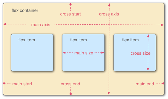
Flex Model
flex-direction
The flex-direction property specifies how flex items are placed in the flex container. The flex-direction property can have the following values:
row- The flex items are placed in the flex container in the same order as they appear in the source code.row-reverse- The flex items are placed in the flex container in the reverse order of the source code order.column- The flex items are placed in the flex container in the same order as the appear in the source code, but the flex items are laid out in a column instead of a row.column-reverse- The flex items are placed in the flex container in the reverse order of the source code order, but the flex items are laid out in a column instead of a row.
The default value of the flex-direction property is row.
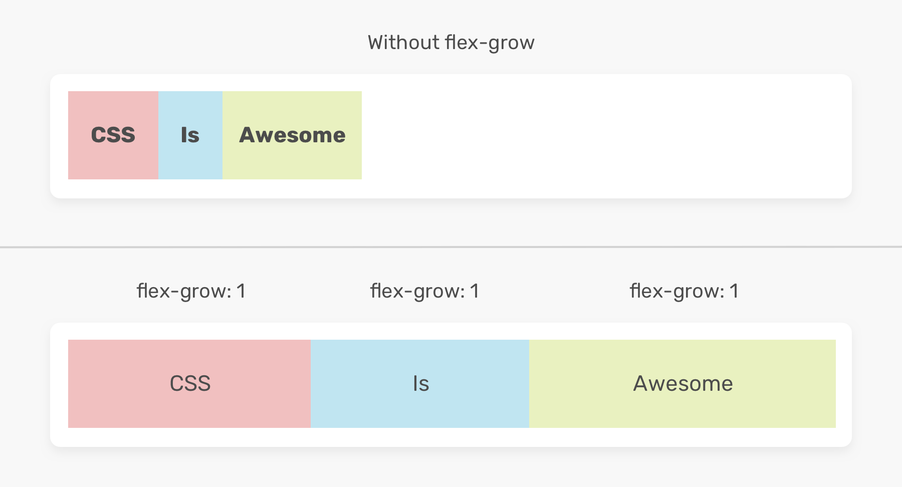
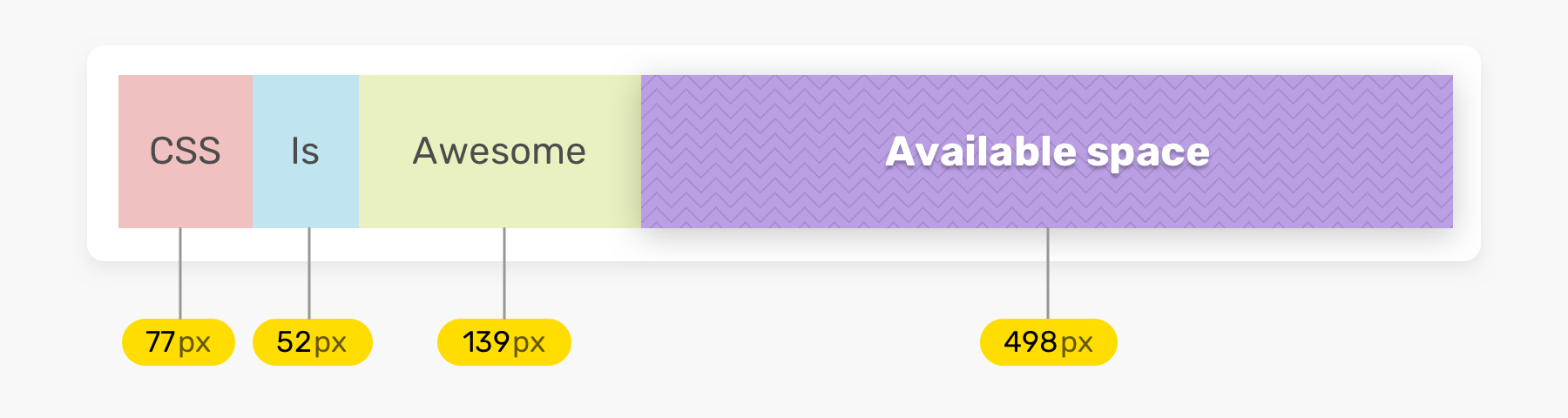
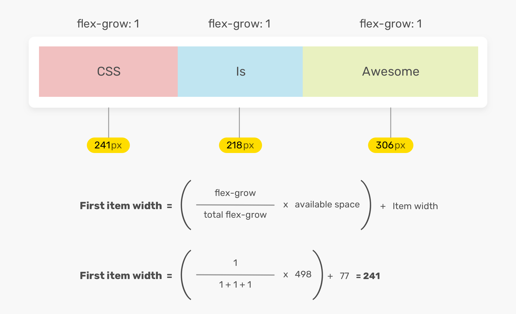
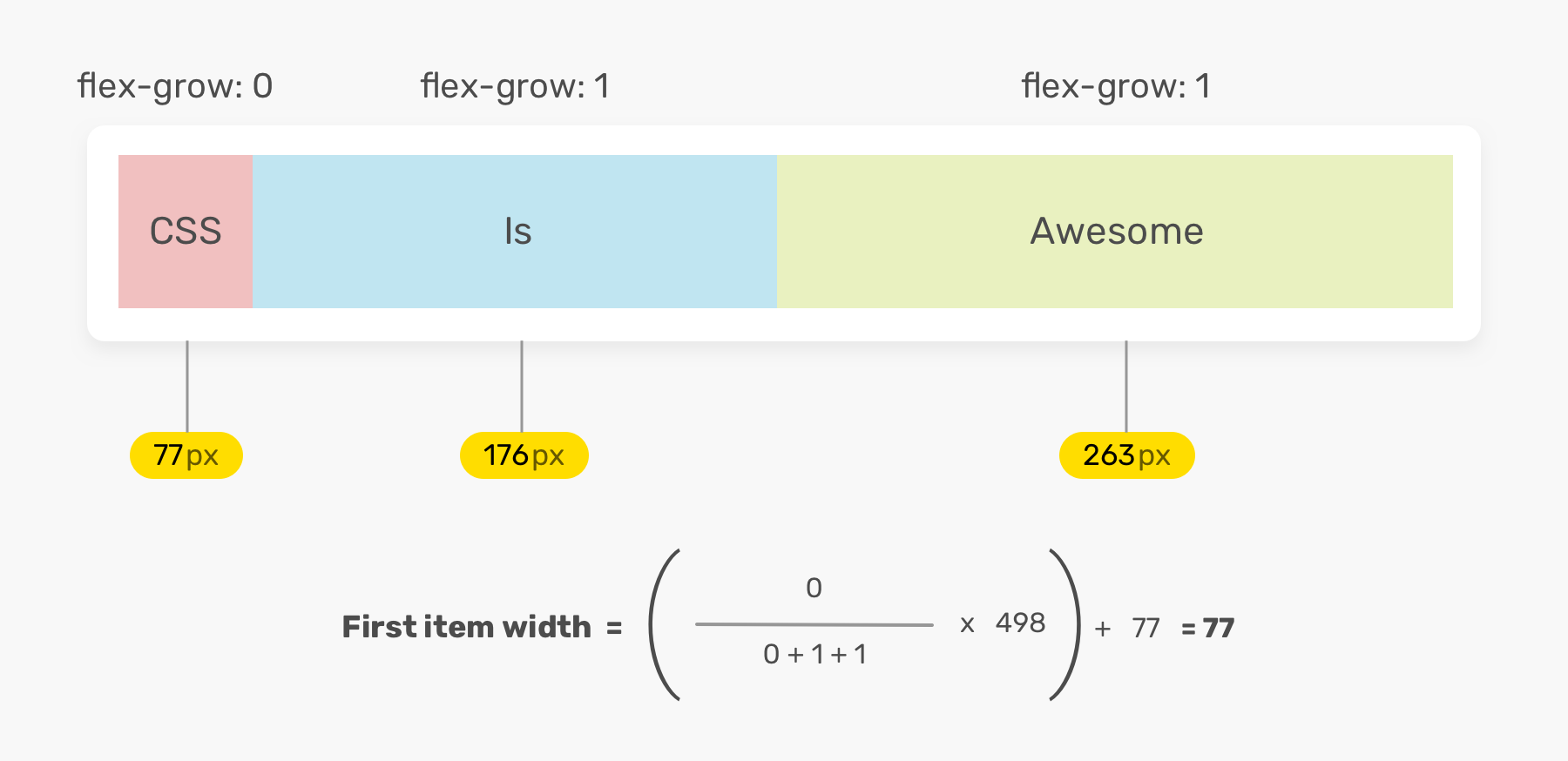
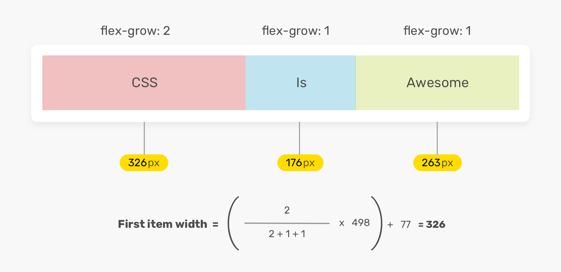
flex-grow
The flex-grow property specifies how much the item will grow relative to the rest of the items in the flex container. The default value of the flex-grow property is 0.
how width is calculated
when 0 or 2
demo
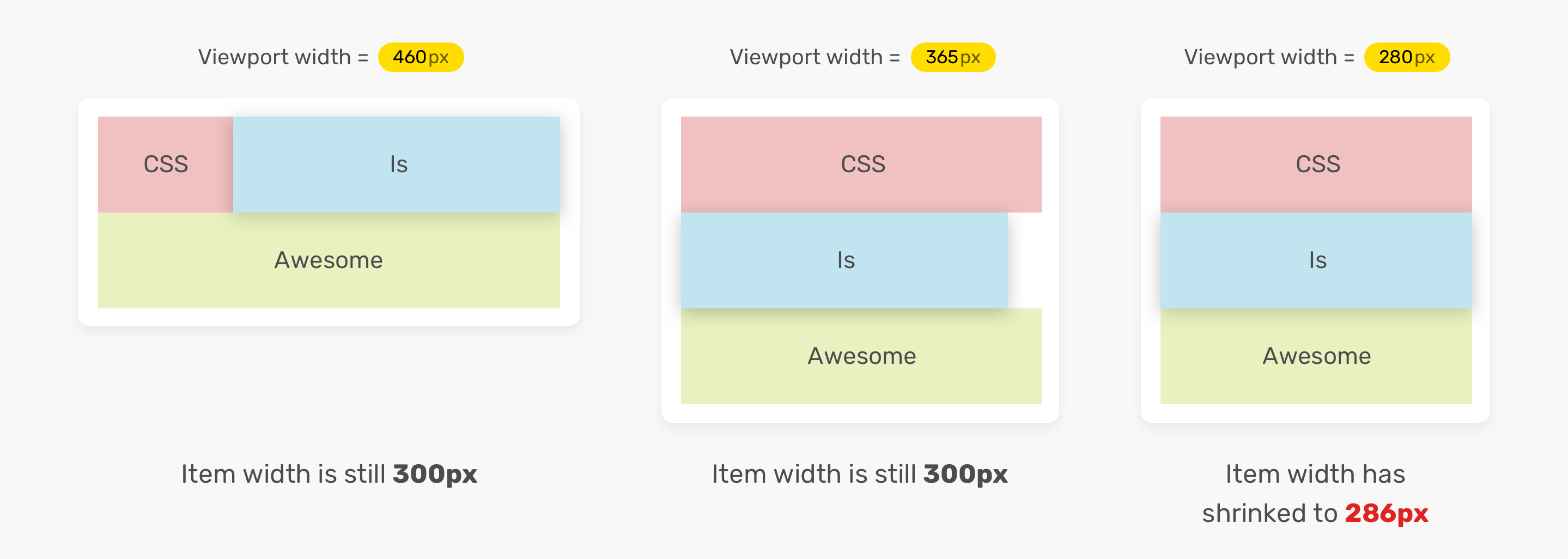
flex-shrink
The flex-shrink property specifies how much the item will shrink relative to the rest of the items in the flex container. The default value of the flex-shrink property is 1.
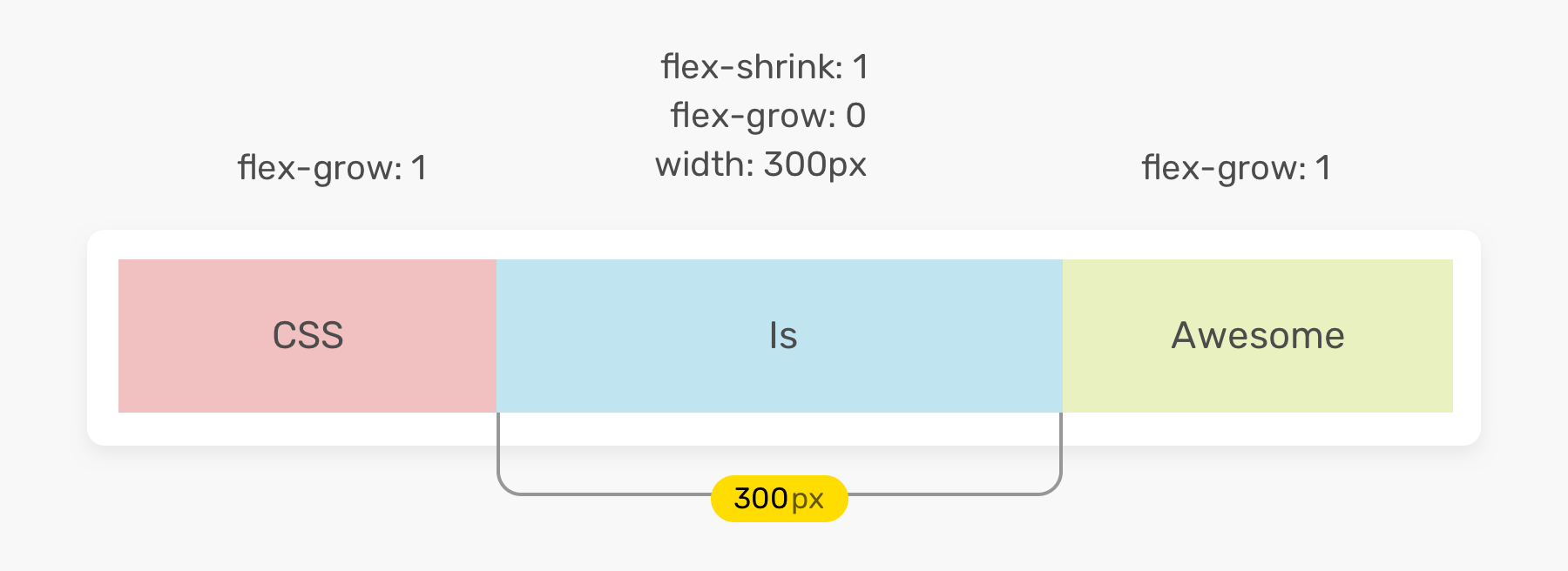
how width shrinks
demo
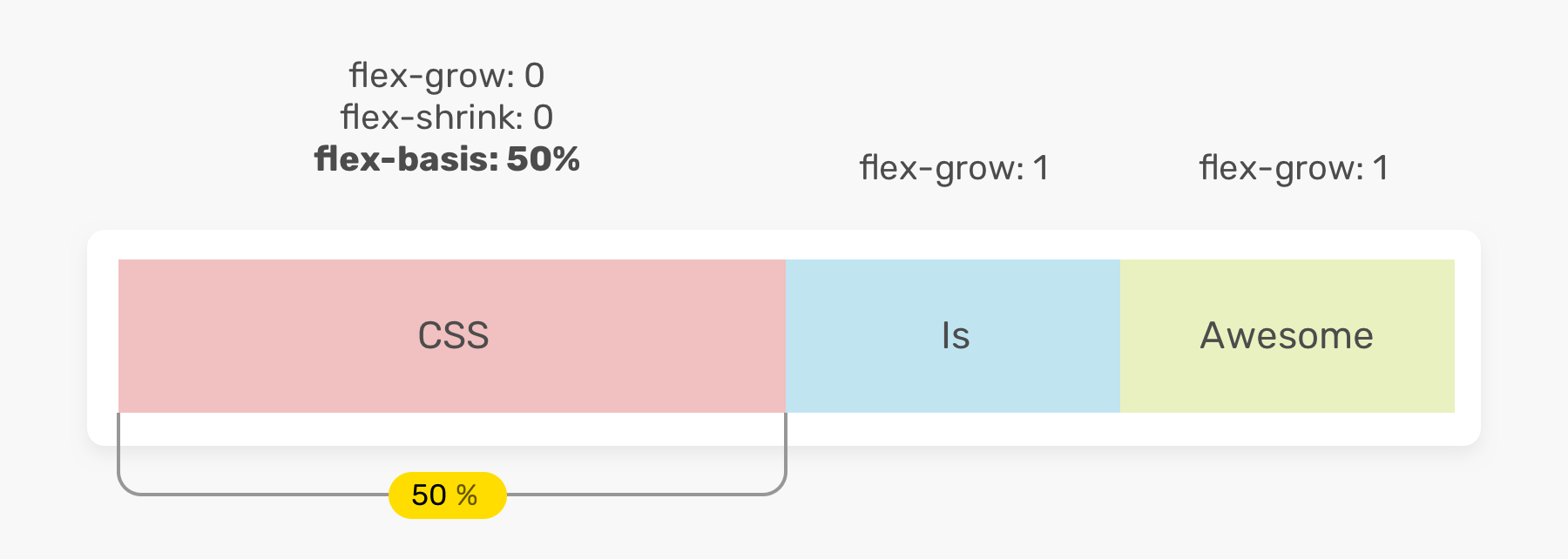
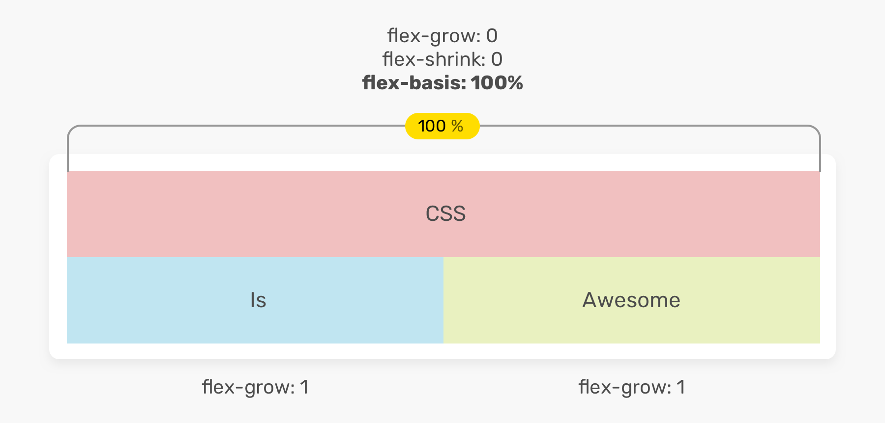
flex-basis
The flex-basis property specifies the initial main size of a flex item. The default value of the flex-basis property is auto.
flex shorthand
The flex shorthand property sets all the flex-grow, flex-shrink, and flex-basis properties of a flex item.
flex: <flex-grow> <flex-shrink> <flex-basis>;Authors are encouraged to control flexibility using the flex shorthand rather than with its longhand properties directly, as the shorthand correctly resets any unspecified components to accommodate common uses.
equivalent values
.item {
  /* Equivalent to flex: 1 1 auto */
  flex: auto;
}
.item {
/* Equivalent to flex: 1 1 0 */
flex: 1;
}.item {
/* Equivalent to flex: 1 1 0 */
flex: 1 1;
}.item {
/* Equivalent to flex: 1 1 100px */
flex: 100%;
}horizontal and vertical alignments
The align-items controls where the flex items sit on the cross axis.
The justify-content controls where the flex items sit on the main axis.

align-items
The align-items property specifies the default behavior for how flex items are laid out along the cross axis on the current line.
- Defaults to
stretch- Items are stretched to take up the remaining space (and may overflow). flex-start- Items are packed toward the start of cross axis.flex-end- Items are packed toward the end of cross axis.center- Items are packed toward the center of cross axis.
justify-content
The justify-content property specifies the default behavior for how flex items are laid out along the main axis on the current line.
- Defaults to
flex-start- Items are packed toward the start of main axis. flex-end- Items are packed toward the end of main axis.center- Items are packed toward the center of main axis.space-around- Items are evenly distributed along the main axis with space in both end.space-between- Similar tospace-aroundbut no space in end.
align-self
The align-self property overrides the default value of align-items on the flex container’s <flex> child.
demo
wrap
The flex-wrap property specifies whether flex items wrap onto multiple lines or not.
- Defaults to
nowrap- Flex items are not wrapped onto multiple lines. wrap- Flex items are wrapped onto multiple lines.wrap-reverse- Flex items are wrapped onto multiple lines in reverse order.
demo
gap
The gap property specifies the size of the gap between flex items on the main axis.
.container {
  gap: 1rem;
  /* Is equivalent to:
  *  row-gap: 1rem;
  *  column-gap: 1rem
  */

  gap: 10px 15%;
  /* Is equivalent to:
  *  row-gap: 10px;
  *  column-gap: 15%;
  */
}
demo
order
The order property specifies the order of a flex item relative to the rest of the flex items. Defaults to 0.